From color psychology to production practice, create your own bedroom aesthetics
Table of Contents
Color Psychology: How does the quilt cover color affect the bedroom atmosphere?
6 popular quilt cover color schemes
Neutral colors: a timeless and versatile choice
Natural earth tones: creating a healing space
Contrasting color design: a visual focus of modern style
Monochrome gradient: a sense of luxury in simplicity
Metallic element fusion: light luxury texture upgrade
Seasonal color matching: flexible response to scene needs
Factory customization advantages: full process support from color cards to mass production
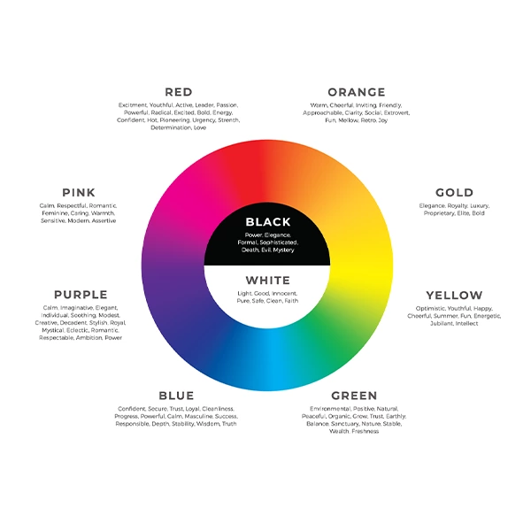
1. Color psychology: How does the quilt cover color affect the bedroom atmosphere?
Through years of experience working with global customers, we have found that:
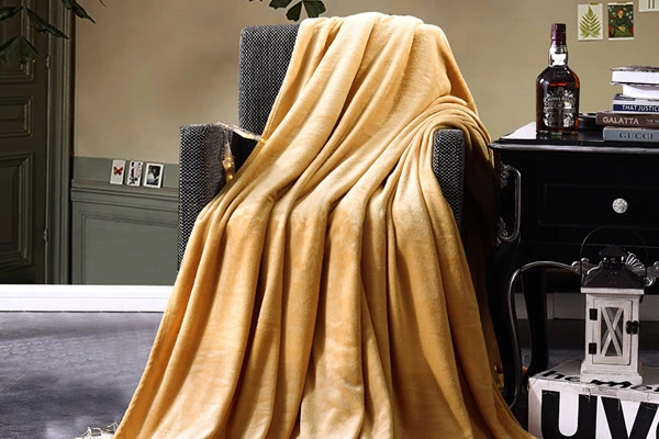
Cool tones (blue/green): reduce heart rate, suitable for scenes with high stress and need to help sleep
Warm tones (beige/brown): create a sense of warmth and improve the comfort of winter bedrooms
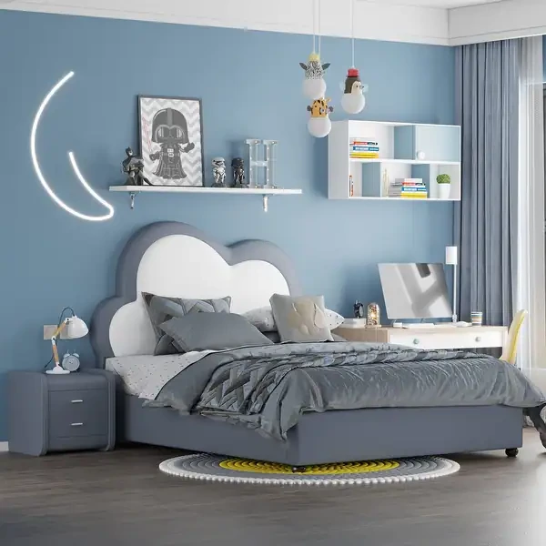
Highly saturated colors: stimulate vitality, suitable for children's rooms or creative spaces (supports CMYK accurate color matching)
2. 6 popular quilt cover color schemes
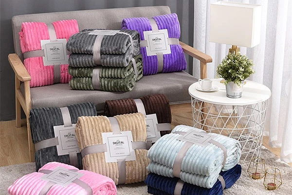
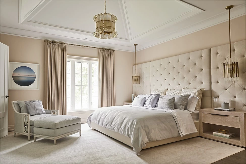
2.1 Neutral colors: timeless and versatile
Factory recommended matching:
Off-white + light gray (50% of orders)
Cloud white + champagne gold piping (preferred for light luxury hotels)
Advantages: suitable for any decoration style, supports batch custom dyeing, color difference control <0.5%
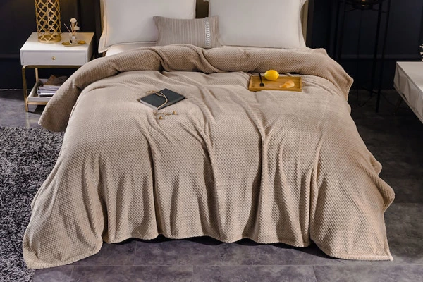
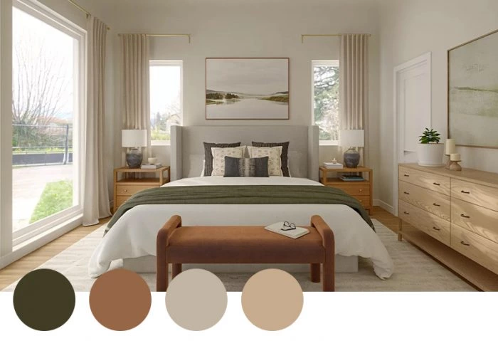
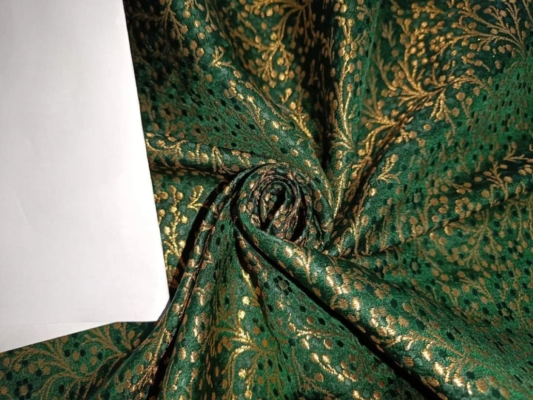
2.2 Natural earth tones: creating a healing space
Production cases:
Terracotta + olive green double-sided quilt cover (hot sale in Europe and the United States in 2023)
Sandstone beige + caramel brown color design (top 3 in Southeast Asian market)
Technical support: washed and distressed/brushed to enhance natural texture
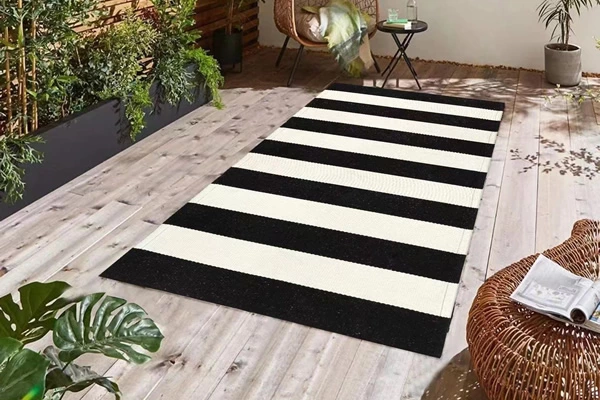
2.3 Contrast color design: visual focus of modern style
Factory technology breakthroughs:
Navy blue × mustard yellow (using reactive dyes, washability up to level 4)
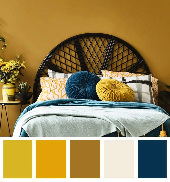
Emerald green + bronze gold embroidery (3D positioning printing accuracy ±1mm)
3. 3 core considerations for choosing quilt cover colors
Space matching: Provide free color simulation service, which can be customized according to the customer's wall/furniture color number
Functional requirements: Dark colors use anti-fading technology (sunlight fastness> level 7)
Cleaning and maintenance: Light-colored products can be equipped with nano anti-fouling coating (extra cost <8%)
4. Factory customization advantages
As an OEKO-TEX certified manufacturer, we provide:
✅ 2000+ color card library: covering RAL/Pantone/CNCS standards
✅ Small batch orders: 500 pieces can be customized
✅ Fast proofing: physical color samples can be provided within 3 working days
✅ Environmental protection technology: GOTS certified organic cotton + low-energy digital printing